Color Converter Guide: HEX, RGB, HSL, HSV, CMYK & WCAG Contrast
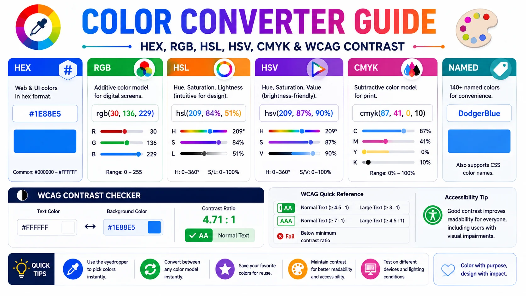
Color is the same physical quantity no matter which notation you write it in — but designers, developers, and print houses each speak a different dialect. This guide explains what each of the five common formats encodes, when to reach for each, and why a modern color tool must also check WCAG contrast and simulate color blindness.
Why Five Color Models Coexist
Every color on a screen is ultimately three numbers — red, green, and blue intensities — and every printed color is four ink percentages. The five formats designers juggle are all restatements of one underlying reality, chosen because each makes a different job easier:
- HEX is compact, copy-pasteable, and works directly in CSS — the default for sharing colors in code and chat.
- RGB exposes the three channel values as readable decimals — useful when you are diagnosing a color in a browser dev-tools panel.
- HSL restructures the same data into hue, saturation, and lightness — the most intuitive model for tweaking a color’s brightness without changing its hue.
- HSV swaps lightness for value — the model Photoshop and Illustrator use, so designers moving between web and design apps need both.
- CMYK is the print model — ink percentages rather than light intensities, essential for anything going to a physical press.
How Each Format Encodes Color
| Format | Channels | Example |
|---|---|---|
| HEX | #RRGGBB (base 16) | #4F46E5 |
| RGB | 0–255 per channel | rgb(79, 70, 229) |
| HSL | H 0–360°, S/L 0–100% | hsl(243, 79%, 59%) |
| HSV | H 0–360°, S/V 0–100% | hsv(243, 69%, 89%) |
| CMYK | C/M/Y/K % | cmyk(66%, 69%, 0%, 11%) |
The conversions are deterministic and reversible on a single device: convert HEX to HSL and back and you recover the same color, because both are restatements of the same RGB triplet. CMYK is the exception — the print gamut is smaller than sRGB, so a vivid screen color compresses when it goes to print and the round-trip loses information.
When to Use HEX vs HSL vs CMYK
- Designing for screens — start in HEX or RGB; both map directly to CSS. Convert to CMYK only at the final export for any print spin-off.
- Building a theme or design system — work in HSL. Tint and shade variants come from changing one channel (lightness), and hue-rotated variants come from changing another. This is why most CSS custom-property color scales use HSL.
- Preparing files for print — switch to CMYK at the end of the workflow and proof on the target paper. Starting in CMYK produces dull web colors because the print gamut is smaller than the screen gamut.
- Sharing a color in chat or docs — HEX wins. Six characters, no function call, instantly recognisable to any developer.
- Tweaking in Photoshop or Illustrator — those tools speak HSV; the converter bridges the gap so you can match screen designs to design-app palettes.
WCAG Contrast and Accessible Palettes
A color that looks clear to the designer is not necessarily readable to the user. The Web Content Accessibility Guidelines (WCAG) define a contrast ratio between foreground and background that any text must meet to be considered legible. The ratio is computed from the relative luminance of the two colors, normalized so pure black on pure white is 21:1 and identical colors are 1:1.
| Level | Normal text | Large text |
|---|---|---|
| AA | 4.5:1 | 3:1 |
| AAA | 7:1 | 4.5:1 |
Large text is defined as 18pt regular or 14pt bold. Build the contrast check into the palette tool, not the audit stage — iterating on a color until it passes takes seconds inside a converter and hours when it surfaces late in a compliance review. A common failure: gray-on-white text that “looks elegant” but scores 2.8:1 against the background and fails AA. A live contrast readout catches that on the first attempt.
Color Blindness and Designing for Everyone
Roughly 8% of men and 0.5% of women have some form of inherited color vision deficiency. The three most common types are Protanopia (red-blind), Deuteranopia (green-blind), and Tritanopia (blue-blind). A converter with a color blindness simulator applies a linear transformation to the RGB matrix to approximate how a chosen color appears under each condition.
The practical failure mode is encoding meaning in hue alone — red for error, green for success — so the two states become indistinguishable to a color-blind user even with perfect contrast. The fix is to pair every color-coded state with a second signal: an icon, a word, a shape, or a pattern. Test your palette by simulating the three conditions before shipping; if red and green collapse into the same muddy brown, your UI fails for ~1 in 12 male users until you add a redundant cue.
Building Palettes: Complementary, Analogous, Triadic
A converter that only translates between formats is doing half the job. The half that saves a designer real time is automatic palette generation — deriving a usable set of colours from a single starting point using the angular relationships on the hue wheel. Because these relationships are defined in HSL, the tool works in HSL, then converts the results back to whichever format you need.
- Complementary — the hue 180° opposite your start. Maximum contrast, ideal for call-to-action buttons and emphasis.
- Analogous — hues 30° on either side. Low contrast, cohesive, the basis of most soft, professional palettes.
- Triadic — three hues 120° apart. Vibrant and balanced, but often needs one colour to dominate so it does not compete with itself.
- Split-complementary — the two hues flanking the full opposite. The punch of complementary contrast with less visual tension.
A practical starting palette usually couples one of these schemes with a tint-and-shade system: keep the hue fixed and step lightness up and down to produce the lighter and darker variants every real interface needs — hover states, borders, backgrounds, and text.
Tints, Shades, and Tones, Without the Guesswork
Mixing colours by hand in HEX is notoriously unintuitive; guessing how much white or black to add almost never lands where you expect. HSL removes the guesswork because lightness is an explicit channel. A tint is the same hue and saturation with higher lightness; a shade is the same with lower lightness; a tone lowers the saturation toward grey while holding lightness roughly steady.
This is the reason design systems prefer HSL tokens: every hover, disabled, and active state becomes a predictable adjustment of one number rather than a re-derived RGB triplet. Build the core colour in HSL, generate its tint and shade variants by stepping lightness in increments of ten, and convert the finished set to HEX or RGB for use in CSS. The consistency you get — every state of every colour behaving the same way — is impossible to achieve reliably by adjusting HEX values by eye.
Proofing for Print Without Surprises
The screen-to-print metamorphosis catches everyone at least once: a vivid RGB blue that looks electric on a monitor dries into a dull, muddier cyan on paper. The reason is gamut — the range of colours a device can physically produce. Screens (RGB light) can render a wider range than most four-colour presses (CMYK ink), so vivid saturated colours get compressed when they cross over.
The safe workflow is to design in RGB, convert to CMYK only at export, and then proof on the actual paper stock with a calibrated print before committing to a full run. Screen previews of CMYK are simulations — useful, but never exact. If a specific colour is business-critical (a brand logo), order a printed proof of the exact ink values rather than trusting the on-screen approximation.
Frequently Asked Questions
What is the difference between HEX and RGB?
When should I use HSL instead of HEX or RGB?
What is CMYK and why does it look different on screen?
What WCAG contrast ratio do I need to pass?
Why does my design fail for color-blind users even though the contrast is fine?
How does a color converter compute a complementary or analogous palette?
Convert colors and check accessibility in one place
The ToolWise Color Converter translates between HEX, RGB, HSL, HSV, and CMYK, generates complementary and analogous palettes, runs a live WCAG contrast check, and simulates color blindness — all in your browser.
Open Color Converter →