How to Resize Images Without Losing Quality
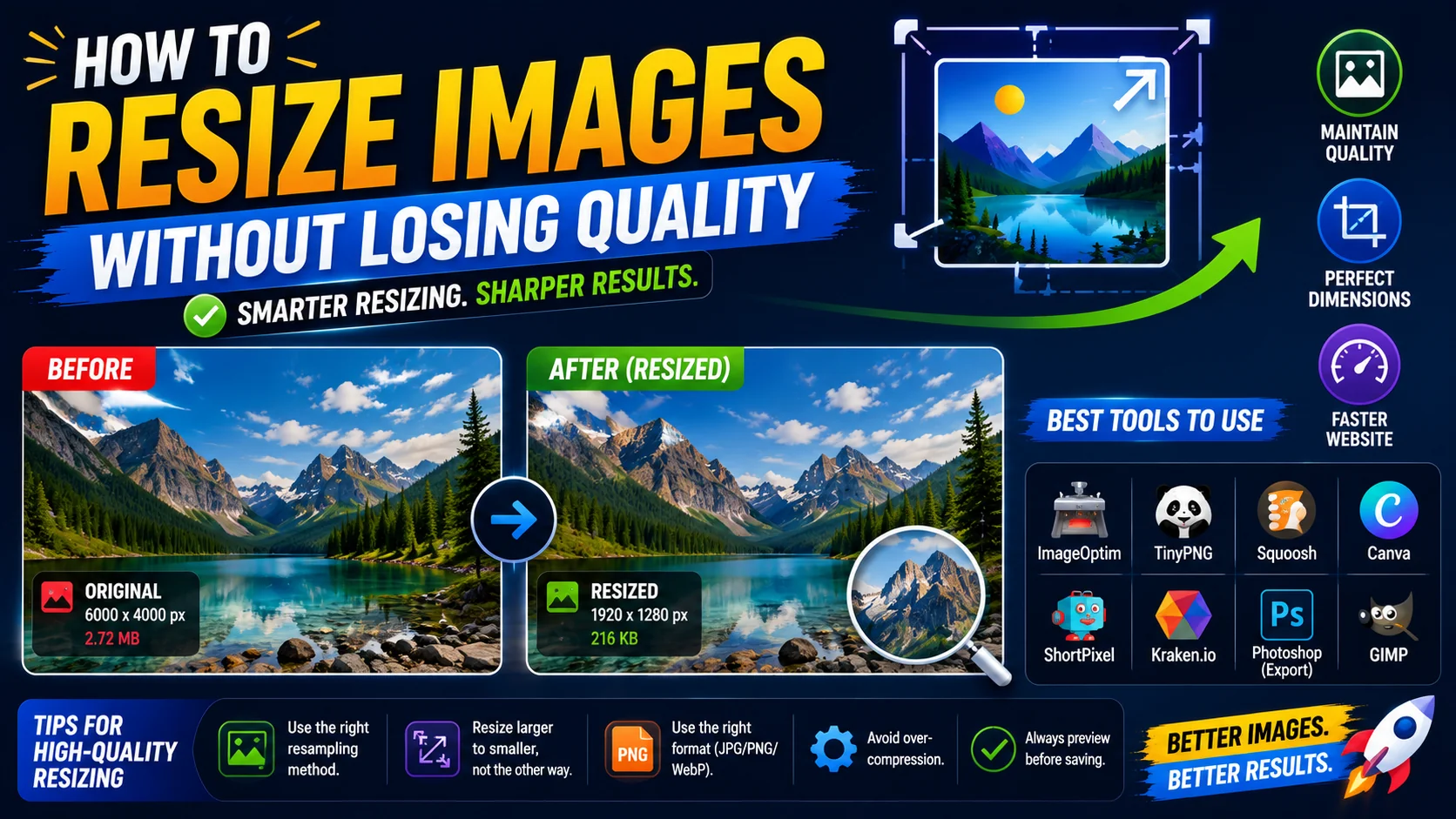
Resizing images while maintaining quality is crucial for web performance and visual appeal. Whether you are a blogger, a web developer, or a designer, the same handful of best practices will save you time, sharpen your output, and keep your pages fast. This guide breaks them down, then shows them applied with the ToolWise Image Editor.
Understanding Image Scaling
When you resize an image, you are changing the number of pixels that represent the visual information. Downscaling (making an image smaller) generally preserves quality well because the resizing algorithm averages neighbouring pixels — the result is a clean, sharp smaller image. Upscaling (making an image larger) does the opposite: it has to invent pixels that were never there, which is why upscaled images tend to look soft or blocky.
This asymmetry is the most important thing to understand about image scaling. You can almost always shrink an image with no visible loss, but you cannot enlarge it without degradation. Plan your source resolution accordingly: shoot or export at the largest size you will ever need, treat that file as your master, and only ever downscale from it for delivery.
Best Practices for Resizing
Following these practices keeps quality high and file sizes low:
- Start with high resolution. Always begin from the highest-resolution source image available; downscale from there rather than upscaling.
- Maintain aspect ratio. Lock the aspect ratio whenever you resize to prevent stretching or squashing, unless the distortion is intentional.
- Choose the right format. JPEG for photographs, PNG for graphics with transparency, WebP for modern browsers, SVG for icons and logos.
- Use the sRGB colour space. sRGB is the standard for web display and ensures your colours look the same across devices and browsers.
- Batch process when possible. Resizing multiple images through the same pipeline keeps dimensions and quality consistent across a set.
- Use a quality resampling filter. Lanczos or bicubic resampling produces sharper, cleaner downscalers than the default nearest-neighbour option.
Image Formats Explained
The format you save to after resizing has a big effect on both file size and visible quality:
- JPEG: Best for photographs and complex images with many colours. Supports lossy compression but not transparency.
- PNG: Best for graphics, logos, and images that need transparency. Larger file size but lossless quality and crisp edges.
- WebP: Modern format with excellent compression and quality, supporting both lossy and lossless modes plus transparency. The best default for the web.
- SVG: Vector format for icons and logos. Resolution-independent, so it never loses quality at any size and is usually tiny.
Resizing vs Compressing
Resizing and compressing are often conflated, but they do different things. Resizing changes the pixel dimensions of an image; compressingchanges how those pixels are encoded to reduce file size. Reducing dimensions from 4000×3000 to 800×600 is resizing; lowering JPEG quality from 90 to 75 is compressing.
The two work best in sequence. Resize first — this throws away the pixels you do not need, for free — then compress the smaller image with the appropriate format and quality setting. Reversing the order forces the compressor to labour over detail you were about to discard, wasting bytes and CPU. For a complete pipeline, see the Image Compression for Web guide.
Social and Web Presets
Different platforms expect different dimensions, and matching them avoids awkward cropping or squashing. A few useful reference sizes for 2024:
| Use case | Recommended size | Aspect ratio |
|---|---|---|
| Instagram square post | 1080 × 1080 | 1:1 |
| YouTube thumbnail | 1280 × 720 | 16:9 |
| Open Graph / link preview | 1200 × 630 | 1.91:1 |
| Website hero (desktop) | 1600 × 900 | 16:9 |
| LinkedIn banner | 1584 × 396 | 4:1 |
The ToolWise Image Editor ships with these presets built in, so you can target a platform with a single click and know the aspect ratio is locked correctly.
Using Our Image Editor
The all-in-one Image Editor combines resize, convert, crop, and rotate into a single browser-based tool. Upload your image, set the desired dimensions or pick a preset, choose your target format and quality, and download the optimised result. It also has ready-made presets for Instagram, YouTube, and LinkedIn so you do not have to memorise the table above.
For the smallest possible web images, follow this sequence in the editor: pick the platform preset (which sets dimensions and aspect ratio), switch the output format to WebP, set quality to around 80, and download. Then run the result through the Image Compressorafter resizing to shave off any remaining bytes without visible quality loss. For web use, converting to WebP at this stage can reduce file size by 25–35% compared to JPEG.
The Upscaling Illusion, and the Right Way Around It
A request that comes up constantly is “can you make this small logo bigger without it going blurry?” The honest answer is no — not in the way people hope. When you upscale, the software has to invent pixels that were never captured, and no algorithm can recover detail that the original did not contain. Sophisticated AI upscalers can make an image look plausible at a larger size, but they are guessing, not recovering, and they often add details that were never really there.
The reliable path runs the other direction. Keep a high-resolution master and always downscale from it for delivery. If the only file you have is already small, the best options are to re-source it (ask for a larger original, re-shoot, or re-export), or to place it at a size where its native resolution looks sharp. Never plan to “fix it later by upscaling” — the fix has to happen before the pixels are lost, not after.
Resizing for Retina and High-DPI Displays
Modern screens pack two or three times as many pixels into the same physical space as older displays, which changes the arithmetic of resizing. An image that is 800 pixels wide will look soft on a 2× Retina screen where the same physical design area is actually 1600 logical pixels. The rule that follows is to export web images at twice the displayed sizewhen sharp text or fine detail is involved — then let the browser scale it down crisply.
This is another reason responsive variants matter. A single image cannot be both small enough for a low-DPI phone and sharp enough for a high-DPI laptop. Serving two or three sizes via srcsetlets each device pull the version that matches its resolution — the high-DPI screen gets the 2× export, and the older phone skips downloading pixels it could never render anyway.
A Before-and-After Check for Every Resize
- Confirm the aspect ratio is locked before exporting — a stretched image is the single most common resize mistake and the hardest to unsee.
- Check that text is still legible. Downscaling can thin letterforms to the point of losing legibility; if text blurs, bump up the export width before it is too late.
- Zoom to 100% and 200% and confirm edges are clean, with no banding in gradients or halos around sharp boundaries.
- Compare the before and after side by side. If the resize introduced visible artefacts, the resampling filter or the source file is the likely culprit.
- Verify the final file size landed where you expected — a resize that does not reduce weight may mean you only changed dimensions without actually reducing the data.
Frequently Asked Questions
Can I make a small image larger without losing quality?
What dimensions should I use for a website hero image?
Should I resize before or after compressing?
Why do my resized images look blurry?
What is the best format for resized web images?
Resize and convert in one place
Open the ToolWise Image Editor to resize with platform presets, convert to modern formats, and download optimised images — all in your browser, with nothing to install.
Open the Image Editor →